Dunkin’ Donuts Gets a Brand Update, But the Orange and Pink Logo Isn’t Going Anywhere
By Sara Shaw • July 6, 2018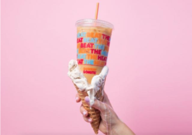
While the Frankfurter font and identifiable orange and pink color palette isn’t changing, Dunkin’ Donuts is putting a modern spin on its branding. Beginning with the iced coffee and the new donut fries, the packaging is, “brighter and more playful,” says Sara Hyman, America CEO of creative agency Jones Knowles Ritchie. The chain is looking to increase popularity in other ways including a simplified menu, updated stores and putting more emphasis on convenience through digital ordering. Read more in the article below about the brand boost and what’s to come.